The principles outlined here will help to guide decision making across all of the touchpoints of our brand.
Our brand idea ‘Simply the Best Casino!’ is our core tagline, bringing the trusted Smooth Radio brand to 24/7 entertainment.
Our attributes Effortless, Credible, Uplifting, and Confident – our guiding principles for being natural, familiar, and always authentic.
Brand Purpose (Mission)
To house all the most iconic games under one roof, providing a clear and unique personality that stands out from the crowd.
Brand Vision
To be the fastest growing online casino in the UK, earning player trust through proven knowledge and expertise.
Brand Positioning
The online casino from Smooth Radio – polished, relaxed, and unmistakably us.
Primary Logo
Primary Logo - Horizontal
Primary Logo - Vertical
Using the Smooth logo as part of the full wordmark, the Smooth brand is instantly recognisable. The neon style of the ‘spins’ ads a playful quality, tying in elements commonly seen in casino and slot games.
Secondary Logo
Secondary Logo - Horizontal
Secondary Logo - Vertical
The white secondary logo should be used over darker colours and in situations where a coloured logo is not as visible as a monotone version might be. The white logo should ideally appear on a brand purple background. These logos follow the same rules as our primary logo on where to use stacked vs inline.
Logo Clearspace
All logo lockups should have a minimum clearspace of the smooth ‘o’. This is with the exception of the social bug which is locked into a set template.
Colours
We developed the Smooth Spins colour palette by drawing directly from Smooth Radio’s established brand pack, leveraging their strong and familiar visual identity to help accelerate recognition and trust in our new brand extension. By aligning with their core purples and complementary tones, we ensure consistency and cohesion across the Smooth family.
The colours are organised into Primary, Accent, and Supporting sections to provide clarity in use.
Primary Colour Palette
Purple
HEX
#8A0DD9
RGB
138, 13, 217
Dark Purple
HEX
#520880
RGB
82, 8, 128
Light Purple
HEX
#E2C1F7
RGB
226, 193, 247
Primary colours drive brand recognition,
Accent Colour Palette
Pink
HEX
#FFC2FF
RGB
255, 194, 255
Accent colours add vibrancy and energy.
Supporting Colour Palette
Black
HEX
#000000
RGB
0, 0, 0
White
HEX
#FFFFFF
RGB
255, 255, 255
Green
HEX
#0DAC26
RGB
13, 172, 38
Supporting colours (including CTA-specific green) guide functionality and usability across digital and physical touchpoints.
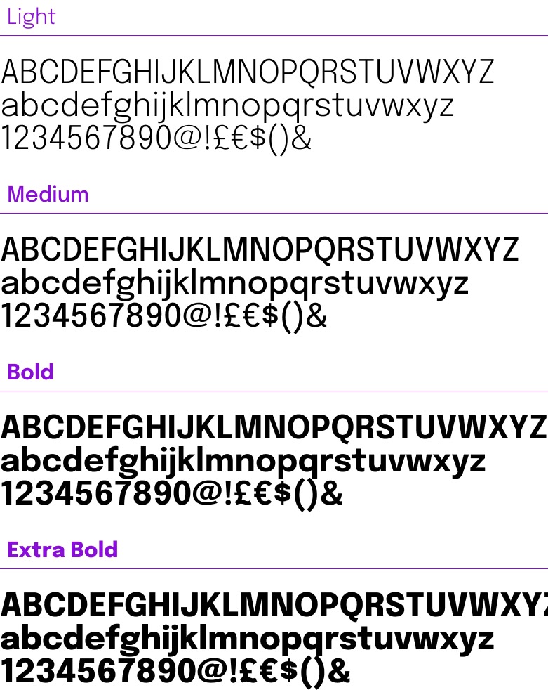
Typography
Epilogue
The typeface for Smooth Spins is Epilogue. Different weights of the typeface are utilised for different applications.
Some examples of these weights are shown on this page.
The typography should not be seen in all caps outside of the logo, this will ensure the correct tone is retained for the brand.
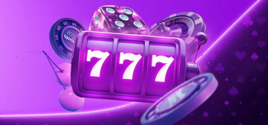
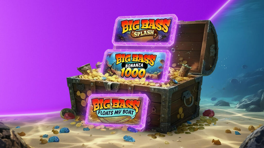
Image Style
We ensure our brand imagery communicates the 3 Cs of Smooth Spins: Credible, Confident, Charming
Tone of Voice
Smooth Spins talks like someone who knows the game inside out. We keep it clear, confident, and welcoming. We’ve got experience, know what we’re doing, and we make people feel like they’re in the right place, whether they’re a seasoned player or new to the reels.
Trusted
Clear. No fluff. We don’t overpromise. We guide, reassure and simplify.
Confident
Polished, relaxed and in control. We know our stuff, and we don’t need to overstate it.
Iconic
Bold but never brash. There’s a presence in how we speak, like a headline act taking the stage.
Passionate
There’s energy in every line. We care about games, players, and creating a safe and fun place to play.
Authentic
Real, not robotic. Warm, human and unmistakably us. No clichés.