The principles outlined here will help to guide decision making across all of the touchpoints of our brand.
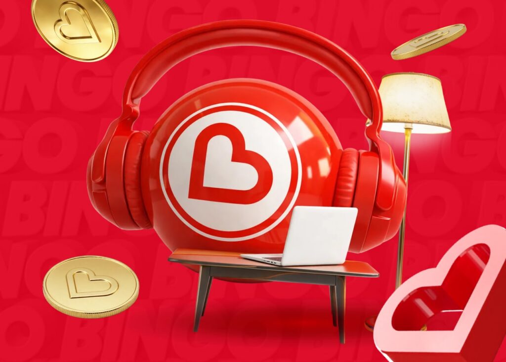
Our brand idea ‘Turn up the feel-good’ is the core idea that our brand should communicate.
Our attributes Inclusive, Enjoyable, Upbeat, Trusted, and Genuine. These are our guiding principles and our way of being.
Brand Purpose (Mission)
To provide a fun, safe place for people to play and be entertained.
Brand Vision
To be the happy place where ‘Hearties’ can play bingo, chat, and have fun together.
Brand Positioning
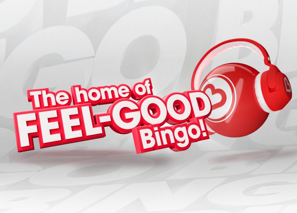
The home of feel-good bingo.
Logo
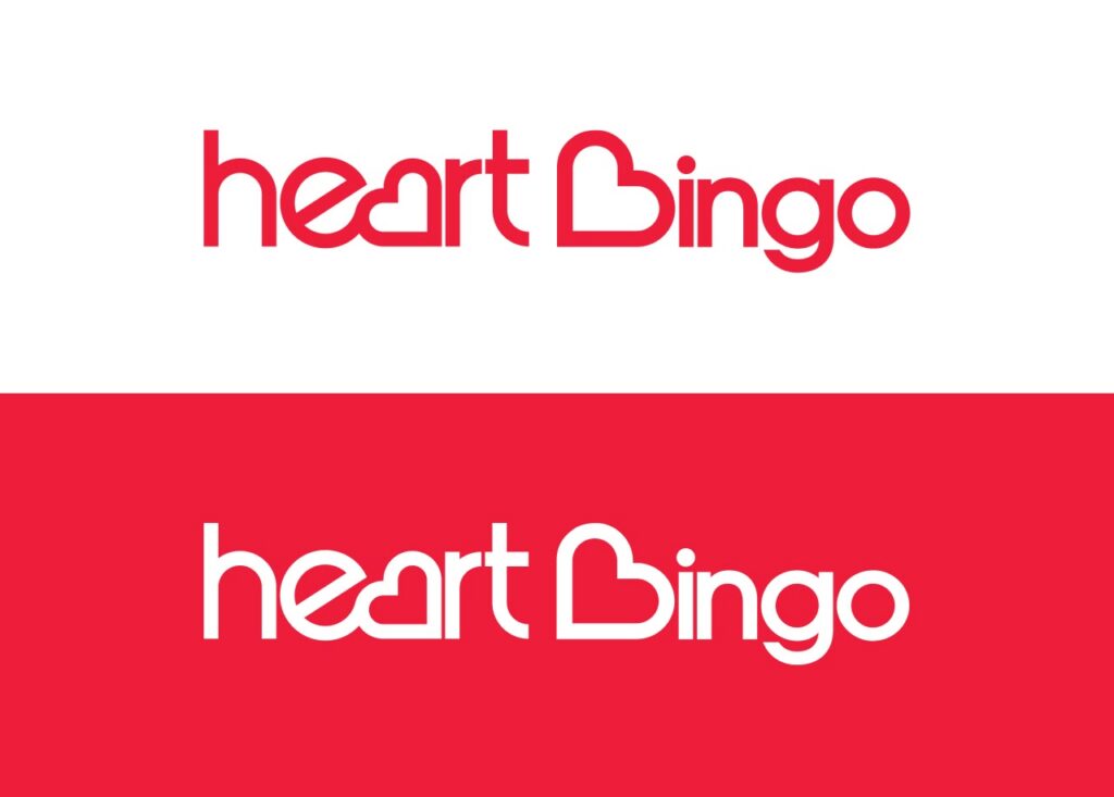
Primary Logo - Horizontal
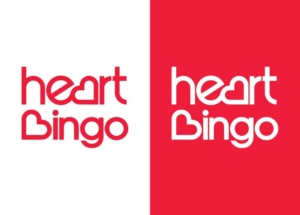
Secondary Logo - Vertical
By using the Heart icon as part of the full wordmark, the Heart brand is instantly recognisable.
The placement of the letter ‘e’ on its side mirrors the placement of the Heart icon and adds a light-hearted quality, tying in with the fun and joyful nature of the brand.
The rules around our fixed assets are nonnegotiable but we do have enough variations to provide flexibility depending on where our brand is being displayed.
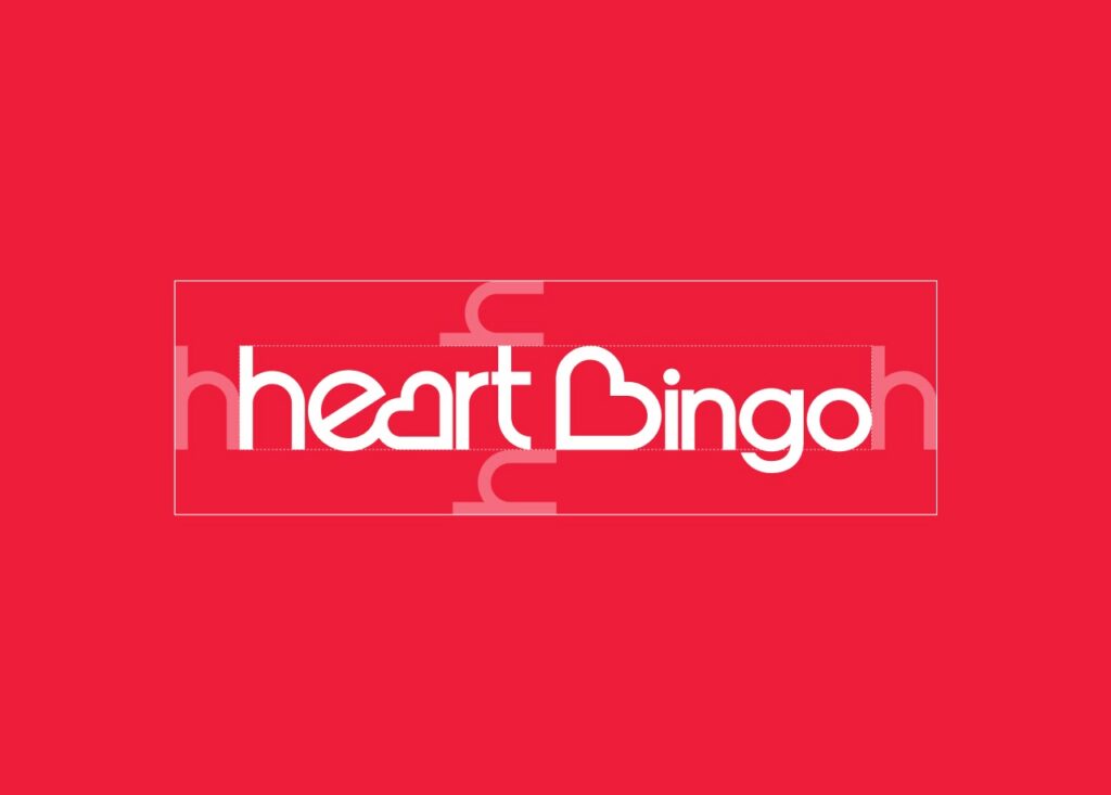
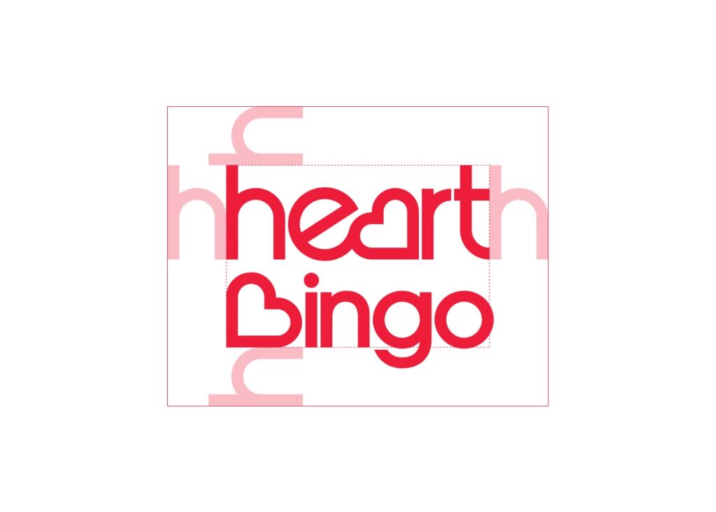
Logo Clearspace
Nothing should obscure our wordmark and there should always be enough clear space around it, as specified here.
Heart Icon
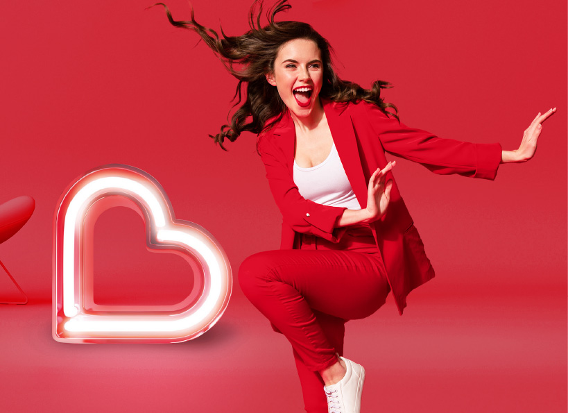
Perfectly balanced and symmetrical, the Heart icon is instantly recognisable. The Heart icon is always used in acquisition, first-time communications with new customers.
Colours
Primary Colour Palette
Heart Red
HEX
#EE1D3A
RGB
238, 29, 58
White
HEX
#FFFFFF
RGB
255, 255, 255
Black
HEX
#020202
RGB
2, 2, 2
We’re a red, black and white brand – strong, simple, contrasting colours. Our main colour is Heart Red and our supporting colours are white and black.
Secondary Colour Palette
Heart Light Orange
HEX
#FAA703
RGB
250, 167, 3
Heart Grey
HEX
#CCCCCC
RGB
204, 204, 204
Heart Brown
HEX
#722A2B
RGB
114, 42, 43
Heart Orange
HEX
#F0591B
RGB
240, 89, 27
Heart Light Green
HEX
#A5D427
RGB
165, 212, 39
Heart Pink
HEX
#FF7F7F
RGB
255, 127, 127
Heart Purple
HEX
#543851
RGB
84, 56, 81
Heart Green
HEX
#0F9324
RGB
15, 147, 36
Heart Blue
HEX
#442F95
RGB
68, 47, 149
Our colour palette also contains various complementary secondary colours to help us enrich our brand.
We use different opacity levels, always of at least 50% opacity to not lose tonality.
Typography
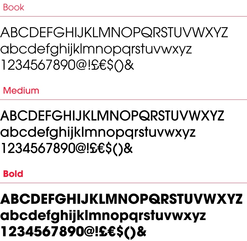
Avant Garde
Our creative work uses Avant Garde in three font levels to ensure our messages are delivered as clearly as possible in the appropriate tone – Book, Medium and Bold.
Our titles use Avant Garde, giving a geometrical and decorative appearance that follow the shape of the logo font.
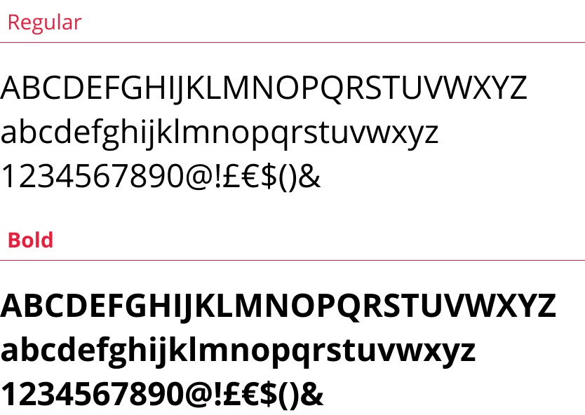
Open Sans
The Heart Bingo website interface and body copy uses Open Sans. This is a clean, light font which is clearly legible across all digital platforms. The consistent use of this typeface creates a familiar and coherent look for the brand.
Image Style
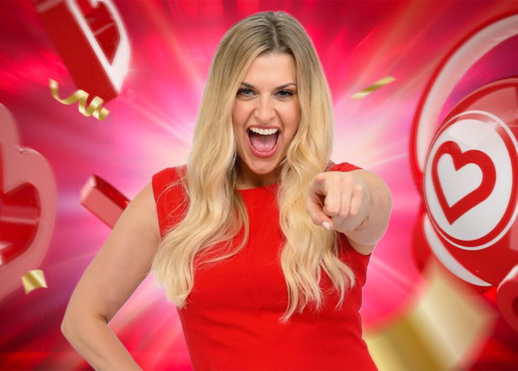
We ensure our brand imagery communicates the 3 Fs of Heart Bingo: Fantastic, Feel-Good and Familiar.
Tone of Voice
Fantastic
Joyful, exciting and motivating. We’re always anticipating the next jackpot!
Familiar
Like chatting with a friend. We’re honest and open, fun and relaxed
Feel-Good
Warm, positive, always happy, enjoying life to the full
Inclusive
Welcoming, supportive and encouraging. We create a community spirit
Clear
Concise, transparent communication, using simple and straight-forward language