The principles set out here guide decision making across every touchpoint, so any two teams shipping in parallel produce the same brand.
Our brand idea ‘Every angle covered’ sits at the centre of AlphiBet — precise numbers, visible terms and the shortest possible route to the bet.
Our attributes Sharp, Ascending, Composed and Straight. These four steer every design and copy decision we make.
Our values Precision, Transparency, Progress and Efficiency. We get the details right, we’re clear about what’s involved, we keep looking for a better way, and we respect people’s time.
Our promise A sharper way to bet. We make betting quick, clear and straightforward, giving customers the information they need without the noise.
Brand Purpose (Mission)
To make betting sharper, simpler and more transparent.
Brand Vision
To lead the next generation of betting. Sharper technology, clearer information and a more considered experience.
Brand Positioning
AlphiBet is the sharp, straightforward choice for bettors who value precision over hype.
Logo
Primary Logo
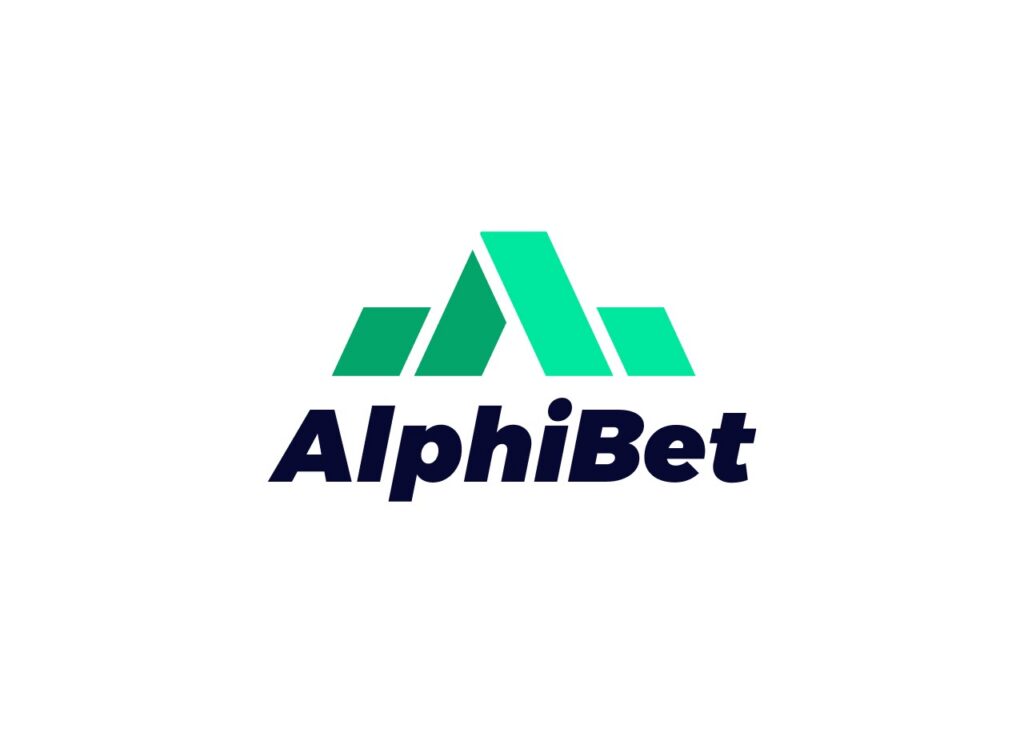
On white and light surfaces
Primary Logo
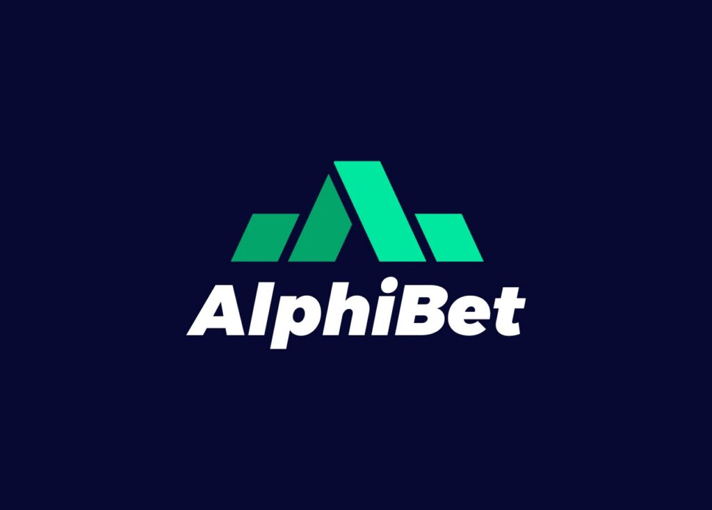
On Ink and dark surfaces
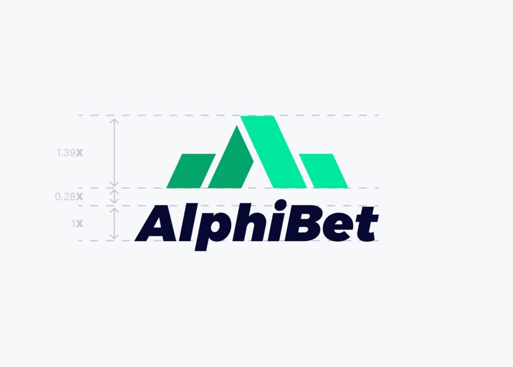
Our logo is a fixed lockup: the Ascent mark — four angled planes forming an A that reads as both a mountain peak and a rising chart — sitting above the wordmark. The wordmark is drawn artwork, not live type, and should never be re-typeset.
The primary logo is full colour: Pitch on the left planes, Mint on the right, with the wordmark in Ink on light surfaces and White on Ink or dark. These are the only two default presentations.
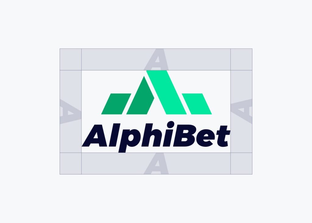
Logo Clearspace
To ensure the integrity of our brand, nothing should ever obscure our wordmark. We utilize Safe Zones to guarantee enough clear space around the logo. This exclusion area is defined by a specific measurement based on the logo’s own proportions, ensuring it remains prominent, legible, and uncrowded by other visual elements or text.
The Ascent Mark
The Ascent mark is our most versatile asset. It carries the brand on its own in app icons, favicons and tight interface positions where the full lockup won’t fit, and it acts as the seal on partner and campaign work.
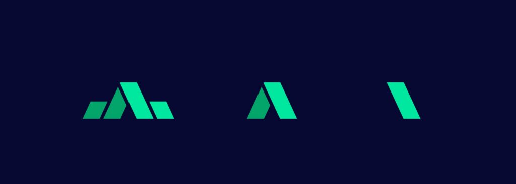
A three-tier reduction system keeps it legible at every size: the full four-plane mark at 48px and above, a two-shape core between 24 and 47px, and the peak alone below 24px. The four planes are never separated or rearranged beyond these two sanctioned reductions.
Logo Variants
01 · Lockup Ink
Primary, light surfaces
02 · Lockup White
Primary, dark surfaces
03 · Mark Full
Mark alone, 48px and up
04 · Mark Mono Ink
Single-colour print, embossing
05 · Mark Mono White
Single-colour on dark
06 · Mark Core
Reduction, 24–47px
07 · Mark Peak
Reduction, below 24px
08 · Wordmark Ink
Wordmark alone, light
09 · Wordmark White
Wordmark alone, dark
Nine sanctioned variants cover every context. Anything outside this set is off-brand.
Contrast and legibility are the core considerations when choosing a variant — always use the version with the highest contrast against your background. Never rotate, skew, stretch, recolour or add effects to the logo, and never place it on busy, low-contrast or brand-green backgrounds.
Colours
Primary Colour Palette
Ink
HEX
#070933
RGB
7, 9, 51
Mint
HEX
#00E79E
RGB
0, 231, 158
Pitch
HEX
#04A56B
RGB
4, 165, 107
White
HEX
#FFFFFF
RGB
255, 255, 255
We’re an Ink and Mint brand. Deep, quiet grounds with one accent doing the work. Ink carries our surfaces and our text on light. Mint is the accent: calls to action, selected states and the leading planes of the mark. Pitch is our secondary green, used for settled wins and the trailing planes.
Secondary Colour Palette
Drift
HEX
#FF4761
RGB
255, 71, 97
Boost
HEX
#00E79E
RGB
255, 184, 77
Info
HEX
#04A56B
RGB
77, 163, 255
Three functional accents layer on top inside the product. Their meanings are fixed: green shortens and wins, Drift lengthens and loses, Boost marks price boosts and promotions, and Info carries links and system messages. We never invert these, and we never pair Mint with Drift decoratively – that combination appears only where it encodes odds movement.
Typography
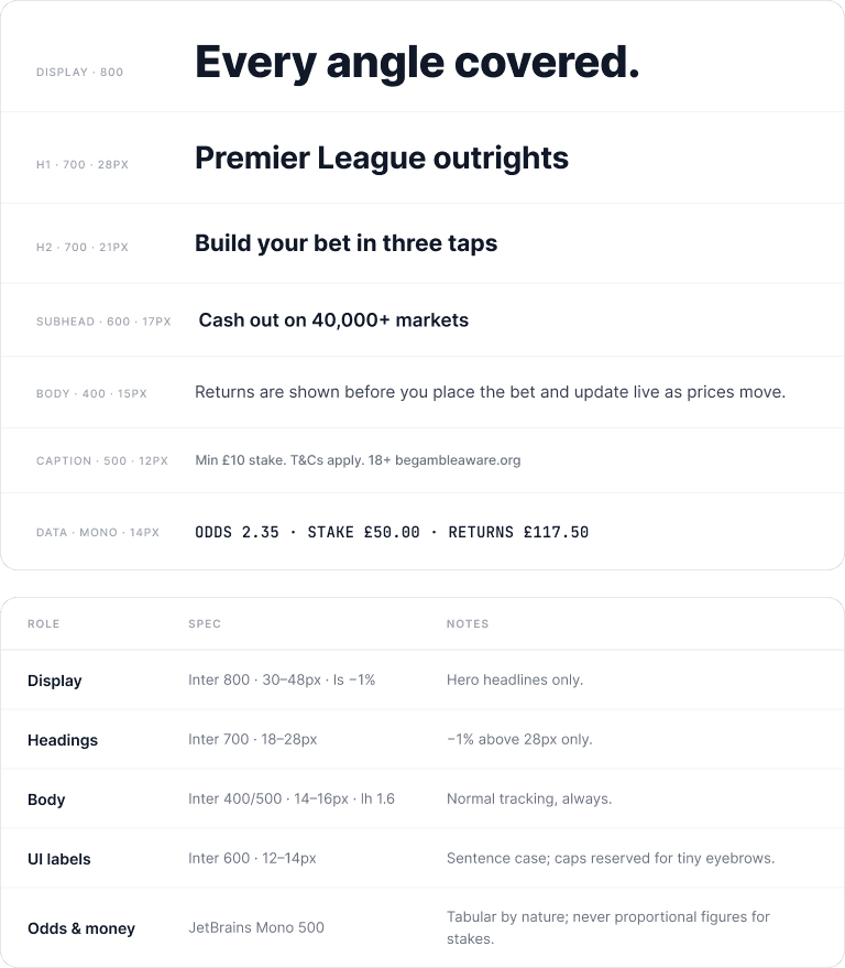
Inter
Inter is our single typeface, set at normal letter-spacing. The only sanctioned adjustment is a −1% optical correction on display sizes above 28px — nothing tighter, and no tracking on body or interface text. We use Regular for body, Medium and Semibold for interface labels, Bold for headings and Extrabold for display.
JetBrains Mono carries odds, stakes, returns and code, so numbers align in columns and read as data rather than copy. Stakes and returns are never set in proportional figures.
Image Style
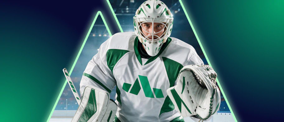
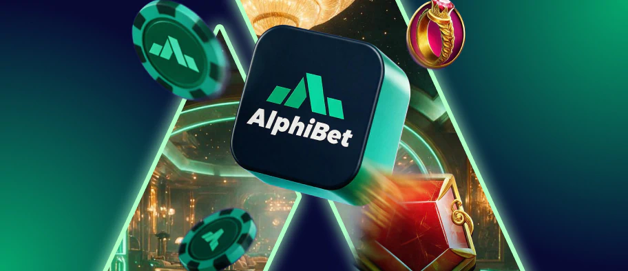
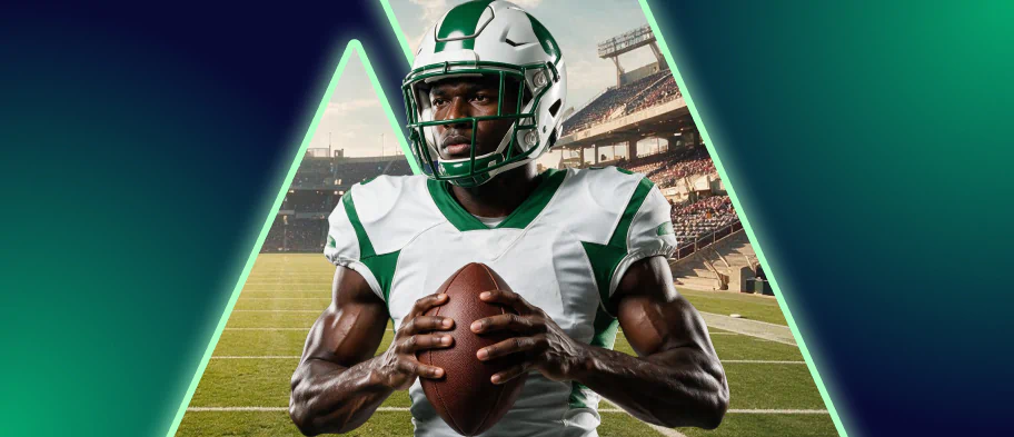
Every image frames its subject inside the Ascent peak, outlined in Mint and glowing against a deep Ink and Pitch gradient. The scene behind — rink, stadium, casino floor — sits dimmed and desaturated, so the aperture is always the brightest thing in the frame.
Athletes, 3D renders and lifestyle shots all use the same device, which keeps sports and casino instantly recognisable as AlphiBet.
Tone of Voice
AlphiBet talks like a sharp trader who respects your time: quick, numerate and dry. Confidence comes from precision, not hype.
We lead with the number, use plain verbs and put terms up front. If a sentence isn’t carrying information, it goes. Composure is also a compliance posture — we never present betting as an income source or a certainty, we set safer-gambling messaging in full legibility, and we describe losses in neutral language.
Assured
We’re confident in what we know and clear in how we say it.
Straight-Talking
We’re direct, transparent and easy to understand.
Numerate
We’re comfortable with data, odds and everything in between.
Responsible
We treat betting with the seriousness it deserves.