To connect our customers to the simple pleasure of gambling.
Our Mission
HOW WE ACHIEVE OUR PURPOSE
To use our knowledge to refine our product so that it’s pleasure to engage with.
Our Vision
WHERE OUR MISSION LEADS
To build on the good reputation of the brand by creating value for all our stakeholders without ever compromising our integrity.
Logo
Primary Logo
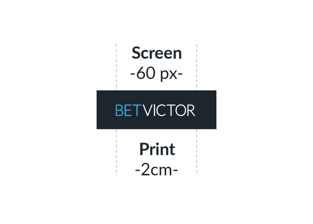
Shortcut
On Blue Dark Background
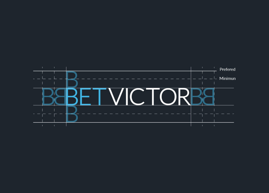
Logo Clearspace
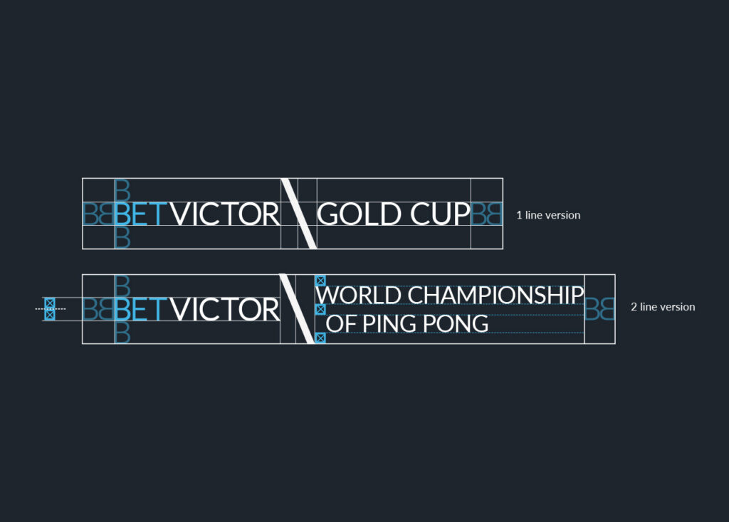
To ensure maximum visibility of our logo, it’s important you keep to the defined minimum or preferred amount of clear space that surrounds it.
The clear space guidelines should be adhered to wherever our logo is displayed.
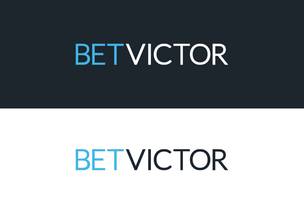
Logo Colours
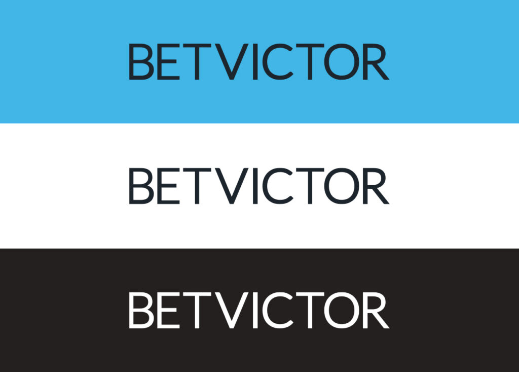
Contrast and legibility are the core considerations when choosing the logotype colour.
Two variations are available – positive and negative. You should always use a version with the highest contrast against your selected background.
Partnership Logos
Contrast and legibility are the core considerations when choosing the logotype colour.
Two variations are available – positive and negative. You should always use a version with the highest contrast against your selected background.
Colours
Primary Colour Palette
BV Blue
HEX
#41B6E6
RGB
65, 182, 230
BV Dark
HEX
#1D252D
RGB
29, 37, 45
BV White
HEX
#FFFFFF
RGB
255, 255, 255
Secondary Colour Palette
BV Red
HEX
#E73C3E
RGB
231, 60, 62
BV Purple
HEX
#A6307D
RGB
165, 48, 124
BV Orange
HEX
#FFAA4D
RGB
255, 170, 77
BV Yellow
HEX
#FBDE40
RGB
251, 222, 64
BV Green
HEX
#009A44
RGB
0, 154, 68
Our extended colour palette offers a broad range of vibrant accents to complement our core brand colours.
Typography
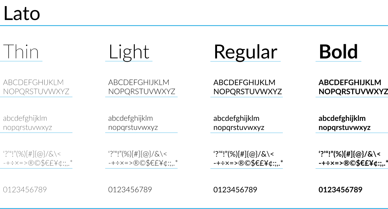
Our communications are written in Lato wherever possible. It’s an elegant typeface that’s clean, modern and legible across print and digital mediums. Four different weights are used to ensure our messages are delivered as clearly as possible for maximum impact; Thin, Light, Regular and Bold. We keep our messaging proportionately balanced by following a structured type hierarchy.
Image Style
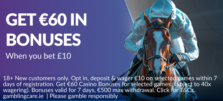
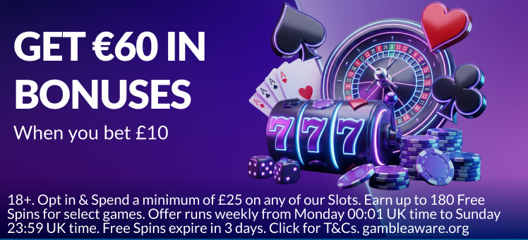
A refreshing blue gradient for Sports, paired with flexible colour gradients for Casino, creates a consistent visual identity. The clean, professional image style ensures BetVictor is instantly recognisable to users.
Our Tone of Voice
HOW WE SPEAK TO OUR CUSTOMERS
Street Smart
We’re not pompous or arrogant but our experience means we know a thing or two.
Refined
Less is more and that allows us some elegance in the loud, brash markets we operate in.
Dry Wit
Gambling is fun. A touch of dry wit is a reminder of that.