The principles outlined here will help to guide decision making across all touchpoints, shifting our focus from a transactional gambling space to a world of deep immersion and cultural engagement.
Our brand idea ‘Feeling Alive’ is the core idea that our brand should communicate, moving away from just adrenaline and toward a smart, immersive entertainment ecosystem.
Our attributes Athletic Determination, Extreme Ownership, Smart Engineering, and Style & Creativity. These are the rules we live by to define the next category of engagement.
Brand Purpose (Mission)
We aim to provide a deeper purpose by creating new levels of immersion that bring our customers as close to the action as possible since 1994.
Brand Vision
To stop thinking like a sportsbook and start building like an entertainment company that competes globally with providers like ESPN, Netflix, and Amazon.
Brand Positioning
To be the essential betting companion that offers a smart presence and world building instead of just odds on a screen.
Logo
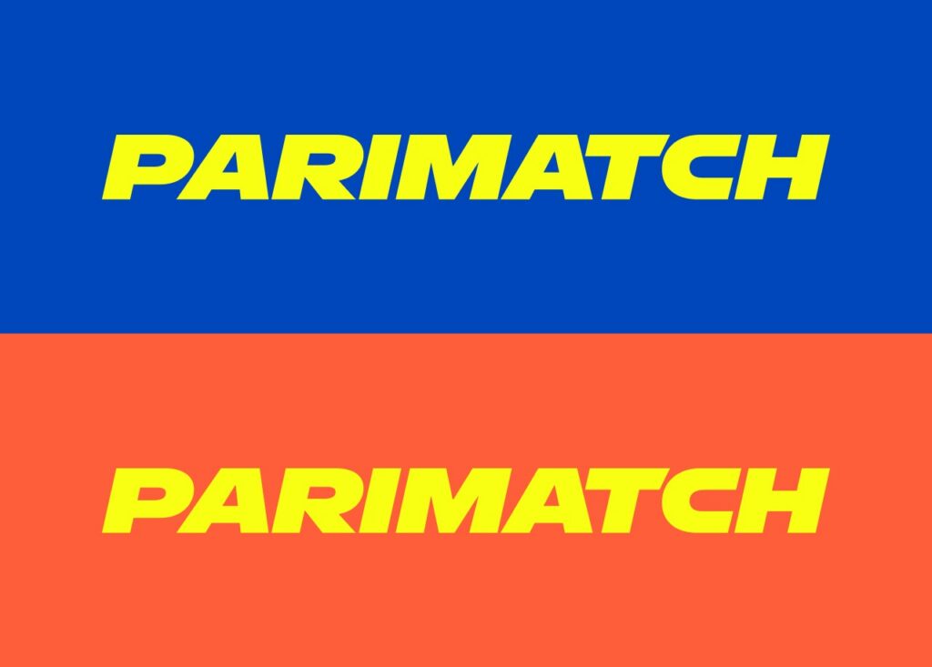
Hero Logo
Inversion Logo
The primary Parimatch logo is a bold, dynamic wordmark that conveys strength, speed, and determination. Its angular slant and tight kerning create a sense of unstoppable forward motion.
The logo is more than a name, it’s a signal.
Bold, direct, and instantly recognisable. On the yellow background, it becomes unmistakable – a clear expression of the brand’s high-energy presence.
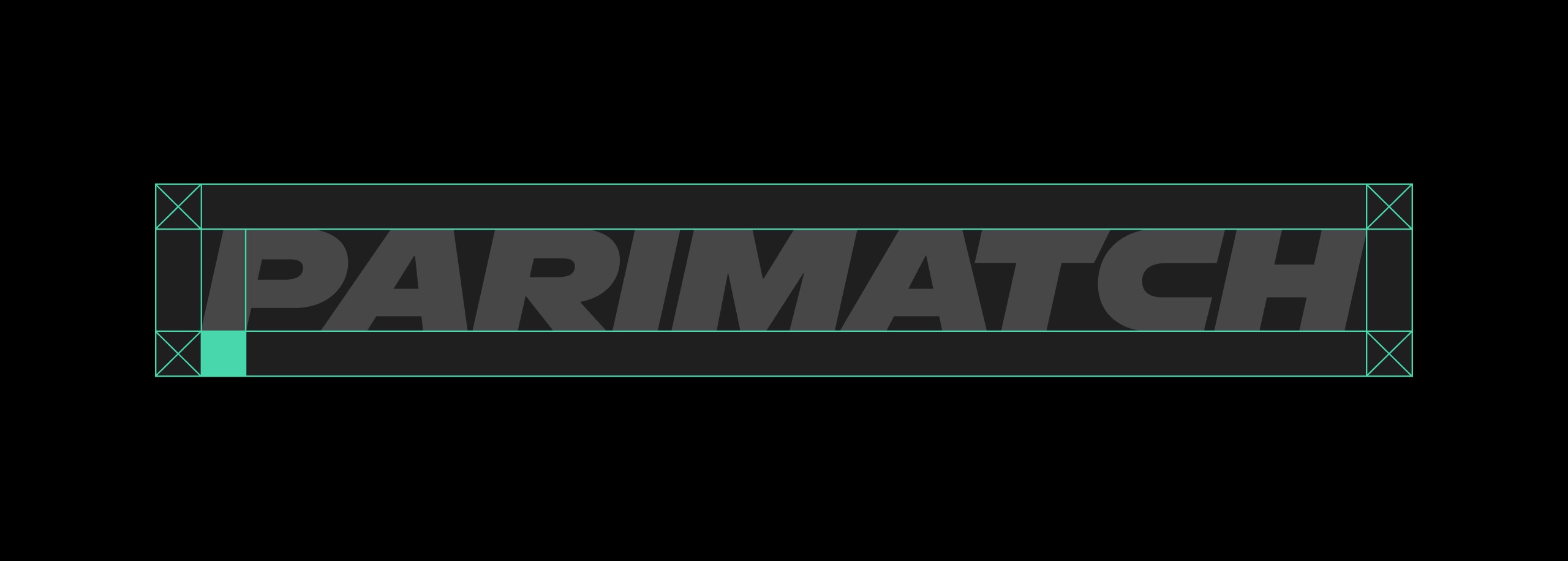
Logo Clearspace
These guidelines ensure there is always enough clear space around the logo.
Colours
Main Colours
Electric Yellow
HEX
#F8FF13
CMYK
5 2 90 0
RGB
248, 255, 19
Pantone
809C
Black
HEX
#000000
CMYK
75 75 75 100
RGB
0, 0, 0
Pantone
PRO BLACK C
Grey
HEX
#C8C3C7
CMYK
20 19 16 0
RGB
200, 195, 199
Pantone
COOL GRAY 3C
Parimatch is a yellow brand. Electric Yellow is not an accent and not a background, it’s the foundation. It’s our visual baseline, our signal, and the colour we are recognised by. Our colour system is simple, focused, and deliberate. Each tone has a clear role in building the Parimatch visual identity.
Signal Colours
Electric Indigo
HEX
#6C00E7
CMYK
70 80 0 0
RGB
108, 0, 231
Pantone
2097 C
Eucalyptus
HEX
#47D7AC
CMYK
60 0 45 0
RGB
71, 215, 172
Pantone
3585 C
Crayola
HEX
#0047BB
CMYK
100 75 0 0
RGB
0, 71, 187
Pantone
2728 C
Portland Orange
HEX
#FF5E3A
CMYK
0 80 90 0
RGB
255, 94, 58
Pantone
171 C
Our extended palette supports expression, flexibility, and differentiation across campaigns, digital products, and brand activations. These colours are not primary, they never compete with PM Electric Yellow, but they help enrich our voice when variety, emotion, or hierarchy is needed.
These colours should be used intentionally and never override the core identity built around yellow.
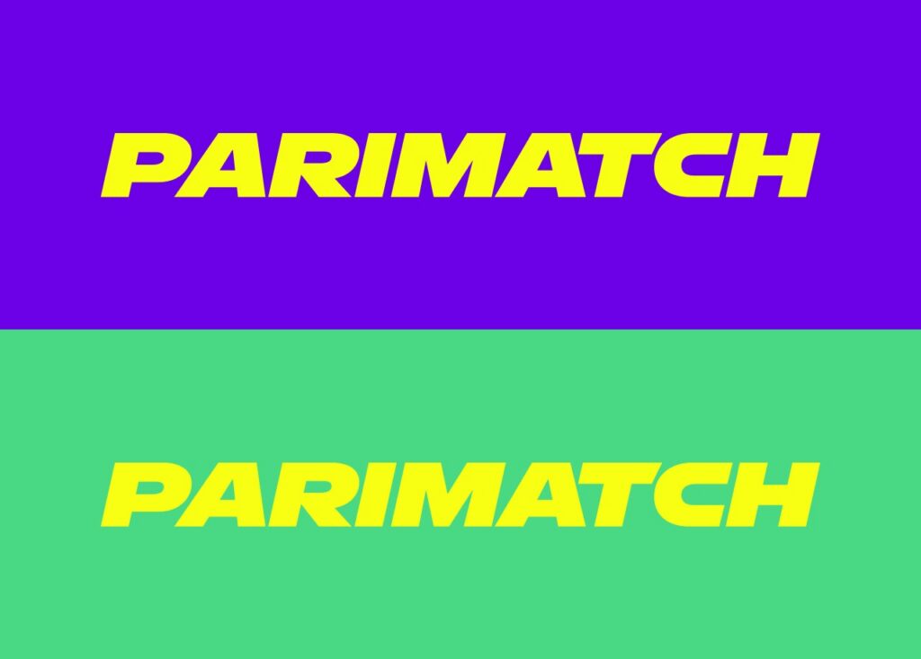
Logo Colours
On signal colours, only the yellow logo should be used. This rule helps avoid any confusion with the core brand palette and reinforces PM Electric Yellow as the brand’s defining colour.
Using a different logo colour on signal backgrounds would undermine the clarity and recognisability of our visual system.
Typography
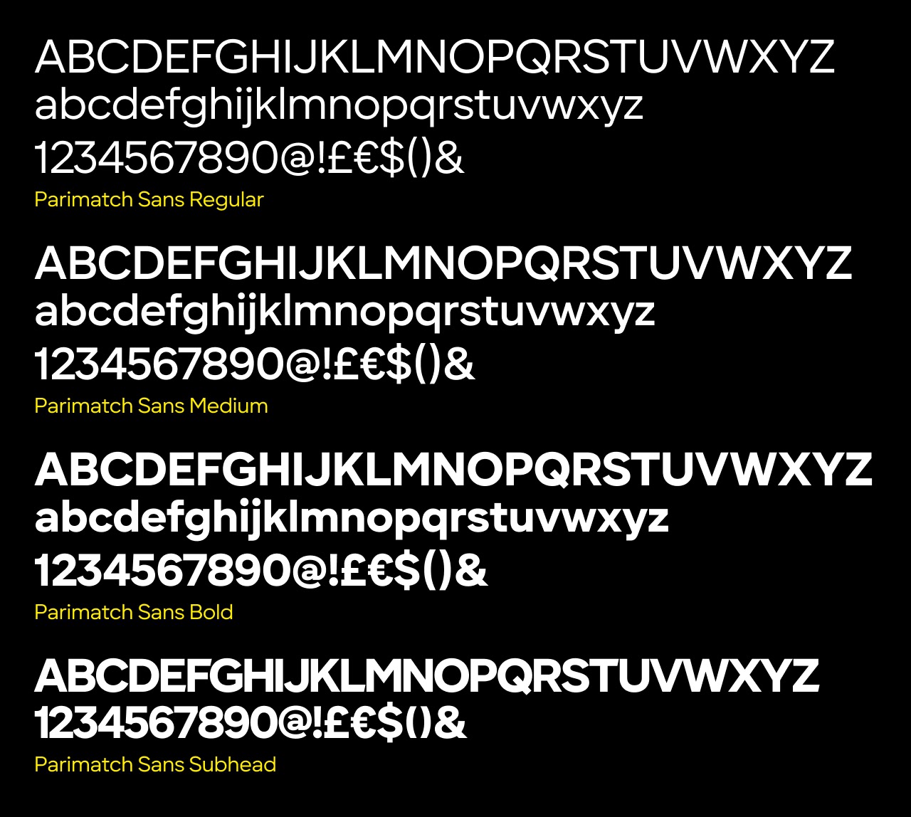
Parimatch Sans
Parimatch Sans comes in four weights: Regular, Medium, Bold, and a specialized Subhead version. This minimal set is sufficient to establish a clear typographic hierarchy from core content to emphasis:
Bold reinforces messaging and works well for headlines, Medium balances clarity and character, Regular ensures comfortable reading for longer texts, and Subhead is used in titles and sub-branding.
Image Style
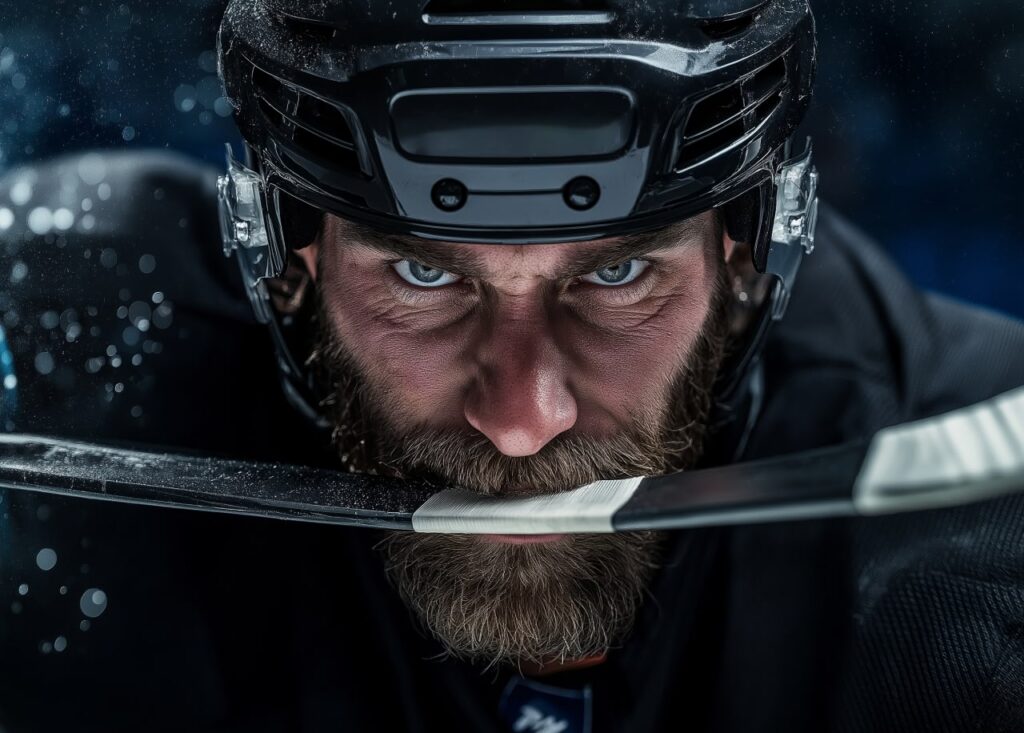
We use three types of imagery across the brand. For sportsbook, we use full colour photography as well photography with a monotone effect applied. For casino we use the various key art supplied by the gaming manufacturers.
Tone of Voice
Our tone is the verbal embodiment of the Modern Gentleman.
Confident
We speak with the unshakable will to win, remaining proactive and focused on results.
Smart
Our communication is simplified and logical, using insights to back our intuition.
Stylish
We think fresh and look sharp. Every word is a strategic part of a bigger message, we are here to lead, not blend in.
Direct
We take extreme ownership of our message. No excuses, no overcomplicating, just clarity