The principles outlined here will help to guide decision making across all of the touchpoints of our brand.
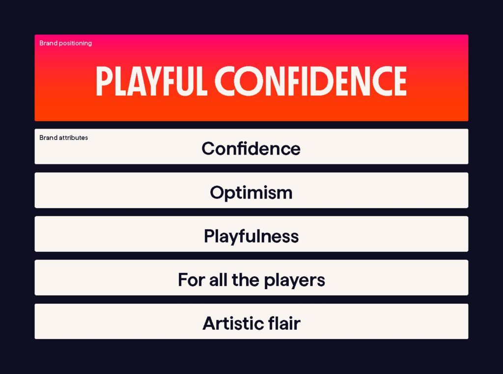
Our brand idea ‘Playful Confidence’ is the core idea that our brand should communicate.
Our attributes How we do things, our guiding principles and our way of being.
Brand Purpose (Mission)
To give players a modern alternative with a brand that embraces innovation.
Brand Vision
To be the first choice for players looking for a prestigious, modern gaming brand, that’s always striving to break new ground.
Brand Positioning
To invigorate the UK market and stand alone as a trailblazing brand.
Logo
Primary Logo Orange
Primary Logo Off White
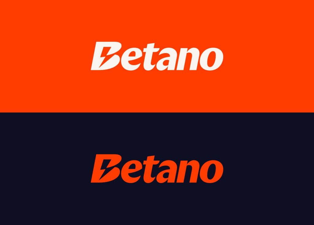
This Betano wordmark is the primary version of the logo that we use in our communications. The presence of orange should always be felt in the logo, either from the colour of the logo itself or by using the off white version on an orange background.
Logo Shortcut
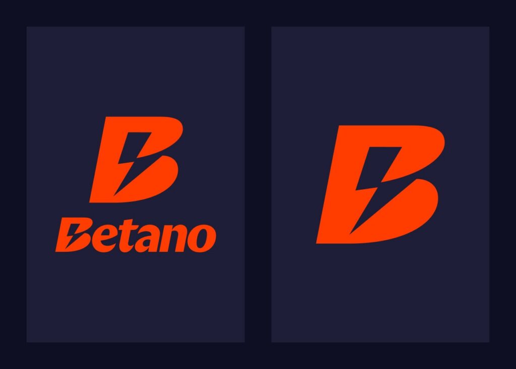
Primary Shortcut Orange
Primary Shortcut Off White
On applications where we can’t use our primary logo, such as a sleeve patch or an app icon, we can use our stacked logo and symbol.
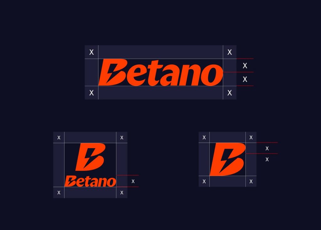
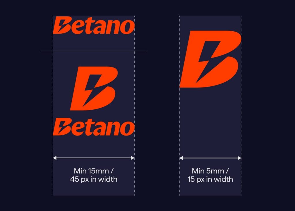
Logo Clearspace & Size
These guidelines ensure there is always enough clear space around the logo.
Logo Colours
The logo colour is determined by the background colour it sits on.
When placing the logo on top of the gradient it must always sit on the orange section. The direction of the gradient can be manipulated to accommodate the desired logo placement.
Colours
Primary Colour Palette
Main Orange
HEX
#FF3C00
RGB
255, 60, 0
Dark Blue
HEX
#0F0F23
RGB
15, 15, 35
Off White
HEX
#FAF5F0
RGB
250, 245, 240
Secondary Colour Palette
Light Blue
HEX
#1E1E37
RGB
30, 30, 55
Off Grey
HEX
#EBEBEB
RGB
235, 235, 235
Pink
HEX
#FF0078
RGB
250, 0, 120
Our extended colour palette offers a broad range of vibrant accents to complement our core brand colours.
Typography
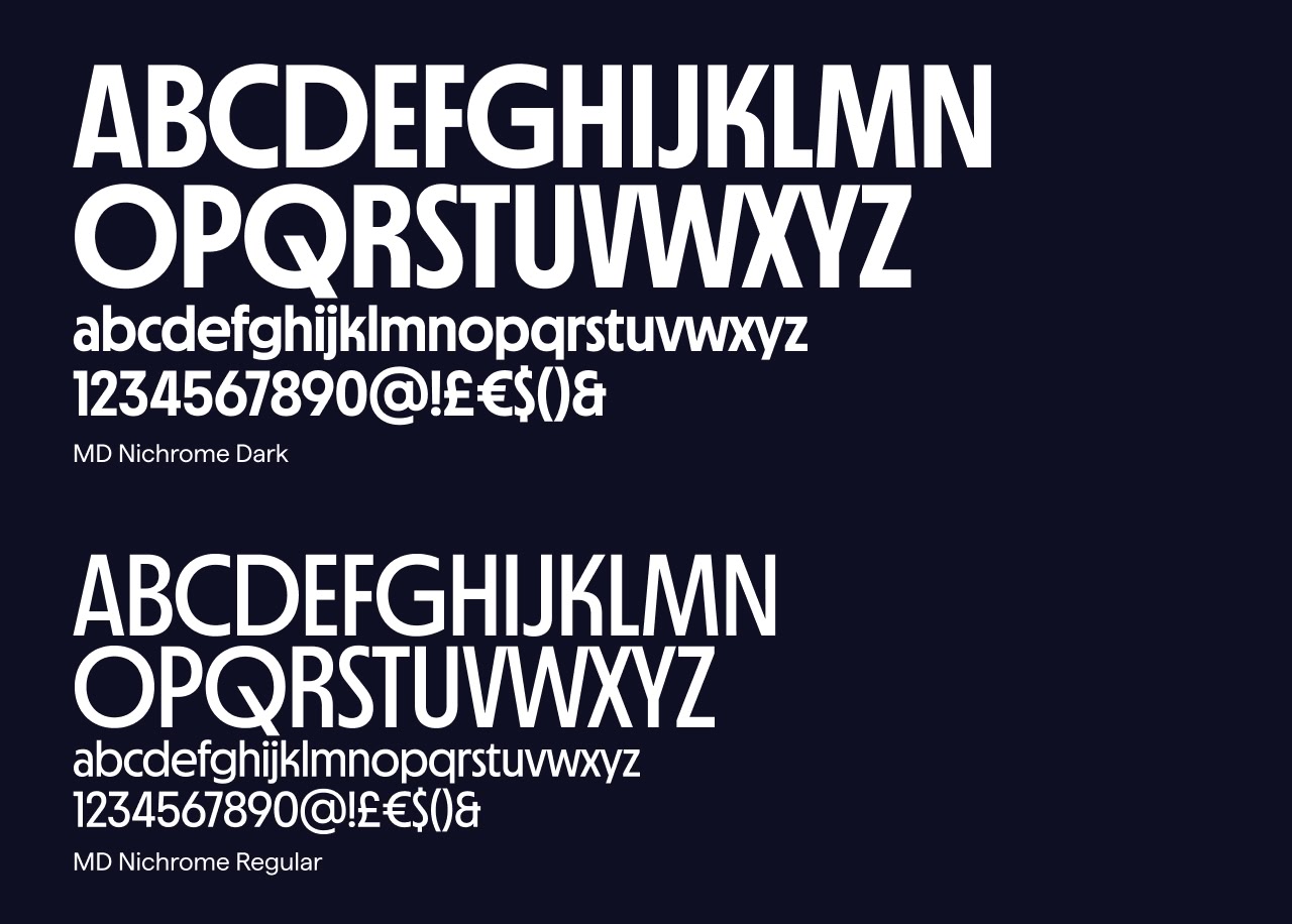
MD Nichrome
MD Nichrome is our headline typeface, used for big moments in small amounts. It’s primary usage will be in uppercase but can also be used in sentence case.
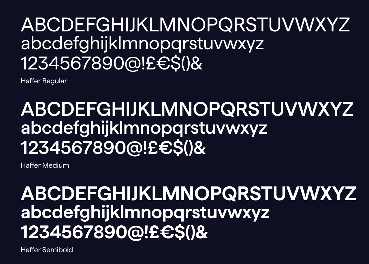
Haffer
Haffer is our secondary typeface, used for smaller text, details and body copy.
Image Style
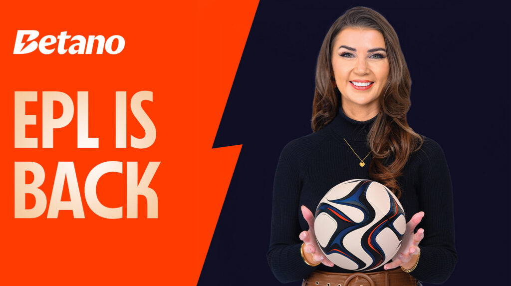
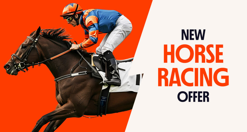
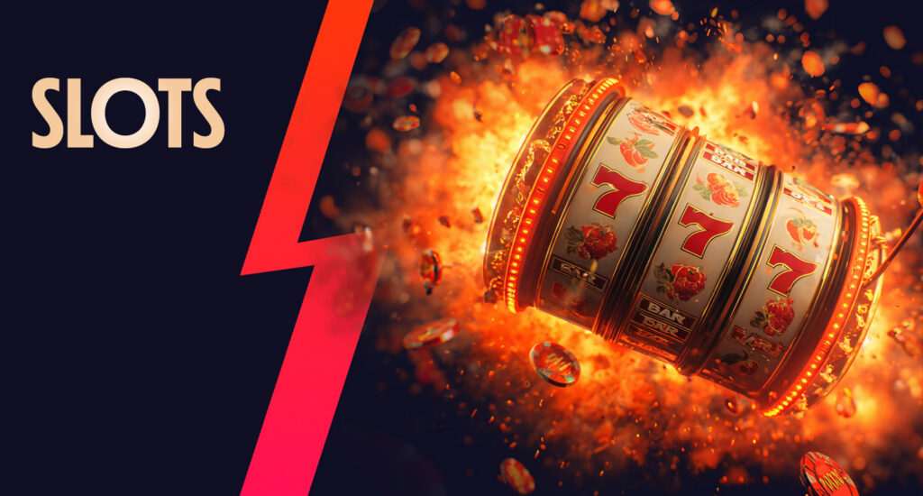
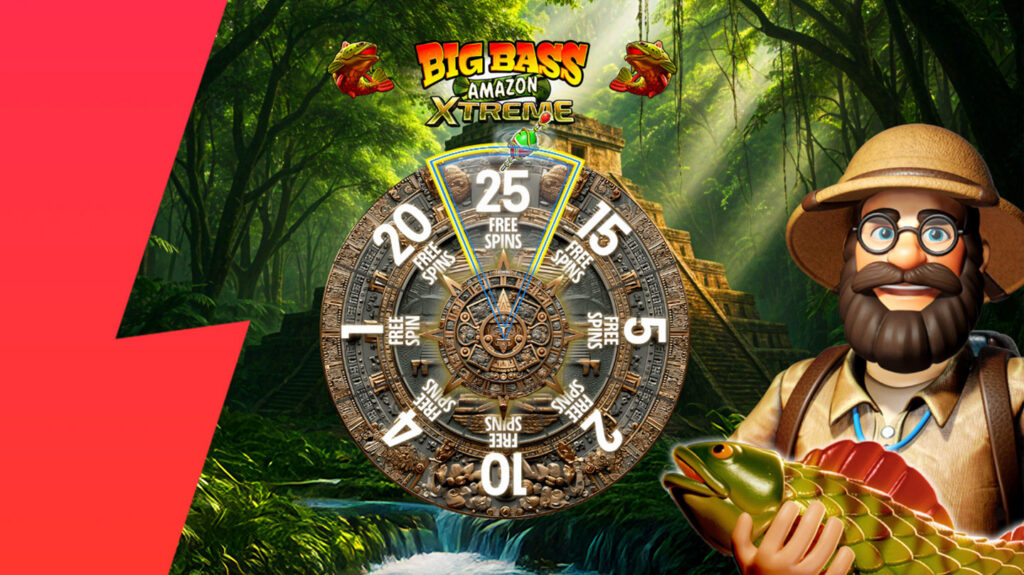
We use three types of imagery across the brand. For sportsbook, we use full colour photography as well photography with a monotone effect applied. For casino we use the various key art supplied by the gaming manufacturers.
Tone of Voice
Confidence
We’re leaders at what we do and approach every challenge with unwavering conviction. Our global achievements drive this mindset, and our language should always capture this. Doing so, reinforces our reputation as pioneers in the industry.
Playfulness
We incorporate a creative edge in our voice, ensuring our communications are both memorable and engaging for our audience. This enhances our brand’s appeal and strengthens its overall identity.
Flair
Our communication is rich with personality, adding a distinctive quality to everything we say. This style ensures we connect with our audience and reinforces our brand positioning, establishing a strong presence in the market.