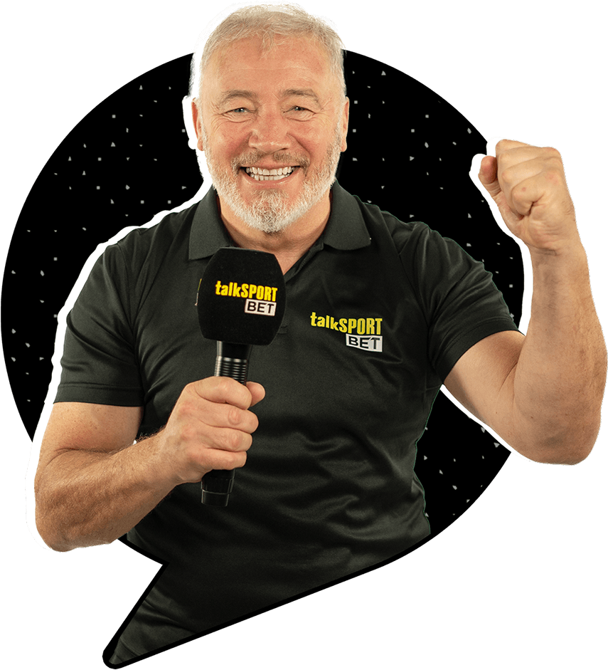
The principles outlined here will help to guide decision making across all of the touchpoints of our brand.
Our brand idea An entertaining, informed, and responsible betting experience brought to you with everything you love about talkSPORT.
Our attributes Entertaining, Down-to-earth, Knowledgeable, and Tuned in. We are unpretentious experts who know what our consumers like.
Brand Purpose (Mission)
To be the principal bookmaker for talkSPORT consumers by providing an equally entertaining betting experience for radio listeners.
Brand Vision
To be the principal bookmaker for talkSPORT consumers who want to bet.
Brand Positioning
Your essential betting companion from talkSPORT, the world’s biggest sports radio station.
Logo
Horizontal Logo
Portrait Logo Off White
By using the talkSPORT logo as part of the full wordmark, the brand is instantly recognisable.
The placement of the word BET in uppercase on a white background replaces the familiar football speech bubble icon used in the talkSPORT radio brand logo.
The full wordmark of talkSPORT BET feels familiar to
talkSPORT customer, our target audience.
Logo Shortcut
Shortcut / App Icon
On applications where we can’t use our primary logo, such as a sleeve patch or an app icon, we can use our symbol.
Logo Clearspace
Nothing should obscure our wordmark and there should always be enough clear space around it, as specified here.
Logo Colours
The logo colour is determined by the background colour it sits on.
When placing the logo on top of the gradient it must always sit on the orange section. The direction of the gradient can be manipulated to accommodate the desired logo placement.
Colours
Primary Colour Palette
Yellow
HEX
#FFED00
RGB
255, 237, 0
Black
HEX
#000000
RGB
0, 0, 0
White
HEX
#FFFFFF
RGB
255, 255, 255
Secondary Colour Palette
Orange
HEX
#FF7200
RGB
251, 114, 3
Grey
HEX
#CDCDCD
RGB
205, 205, 205
Bullder Blue
HEX
#198292
RGB
25, 130, 146
Red
HEX
#C31729
RGB
195, 23, 41
Betboost Green
HEX
#3BE800
RGB
59, 232, 0
Secondary Green
HEX
#357635
RGB
53, 118, 53
Our extended colour palette offers a broad range of vibrant accents to complement our core brand colours.
Typography
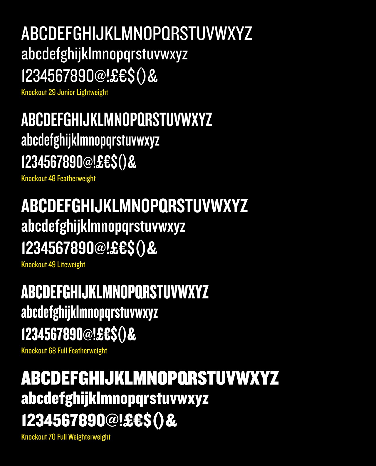
Knockout
MD Nichrome is our headline typeface, used for big moments in small amounts. It’s primary usage will be in uppercase but can also be used in sentence case.
Image Style
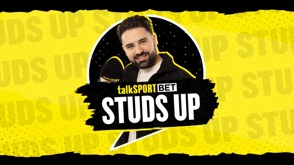
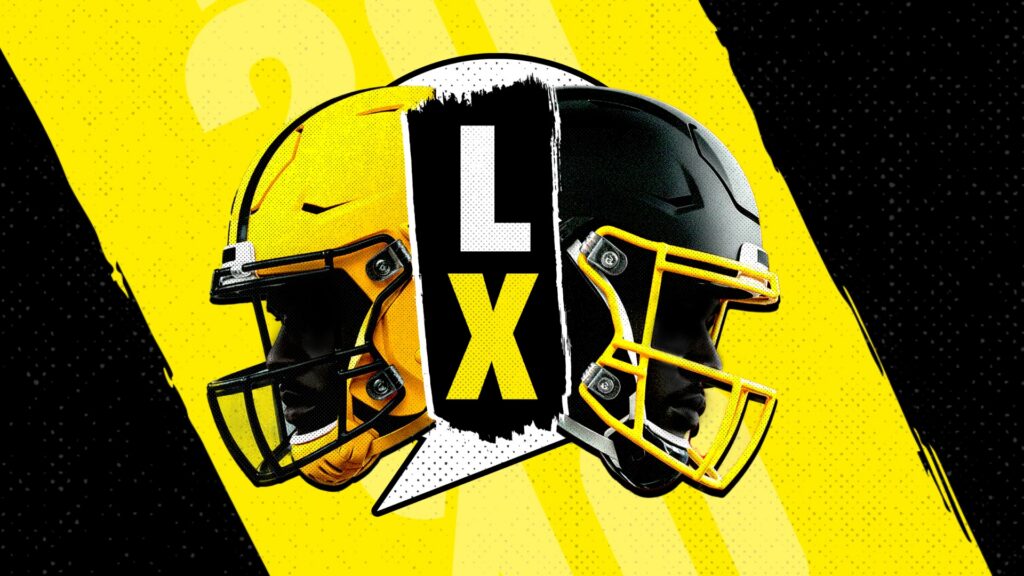
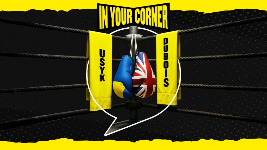
We use three types of imagery across the brand. For sportsbook, we use full colour photography as well photography with a monotone effect applied. For casino we use the various key art supplied by the gaming manufacturers.
Tone of Voice
Entertaning
We are enthusiastic, topical, and light-hearted. While we know when to be serious, our primary goal is to provide a fun betting experience that mirrors the excitement of sports radio.
Direct
We are down-to-earth and unpretentious. We avoid complicated jargon, instead using simple language and transparent communication to remain a relatable companion to our listeners.
Expert
We are knowledgeable and stay “On the Ball”. Our customers rely on us because we really know our stuff, providing informed and reliable markets on the latest sporting topics.
Honest
We are respectful and “Keep it Real”. We speak truthfully to our customers and prioritise their safety by providing clear information and effective Safer Gambling tools.